Seismoview
This was a personal project undertaken to visualize earthquakes as they happen in real time across the globe. The data is sourced from a USGS (United States Geological Survey) feed and is updated every 5 minutes.

Design
The vision was to keep the interactions as simple as possible and ensure the option header is unobtrusive. The major significance was to be given to the map where the earthquake data was to be plotted. Clicking on the earthquake marker would bring up information about the earthquake. The quakes could be filtered based on the time of occurrence or the magnitude.
Technology
The visualization is custom built using Google Maps APIs and the publicly available USGS Earthquake APIs providing data in the JSON format. No server side coding is involved and markers and interactions are coded client side using HTML and CSS.
First Version
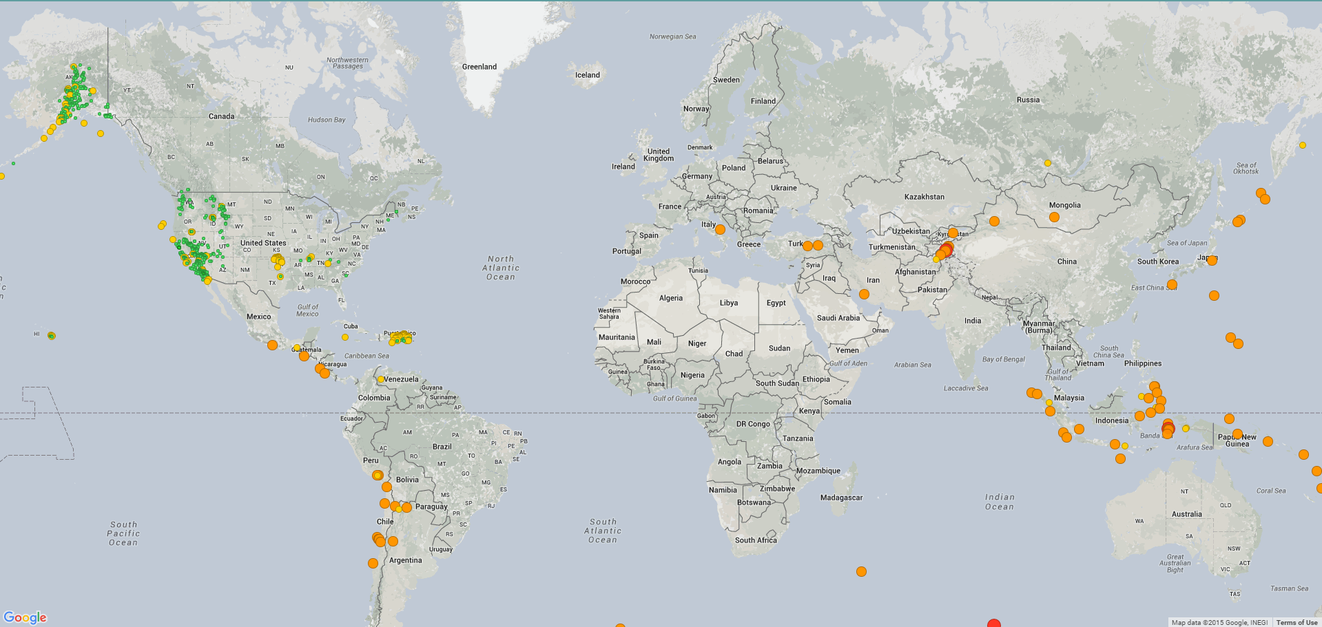
Earthquakes of all magnitudes were marked. Color and size of the marker differentiated the range of magnitude. All earthquakes that occurred in the past 30 days would be displayed. No selectors were present to filter the earthquakes.
The marker could be clicked to get more data about the quake. A lot of information about each quake is fed in by the USGS feed. Only information that will be easily understood by the user was displayed in the popup. These were – magnitude, depth, time, co-ordinates and location

Limitations
The USGS data collects data form its own observatories and others across the globe. The earthquakes that were up to around magnitude 2.5 were located mostly in the US as worldwide data would run into thousands of data points every day and this data was generally not available in the USGS feed. Showing markers for earthquakes less than 2.5 in magnitude could mislead users about their distribution.
Plotting all the earthquakes, especially for 30 days, would slow down the website performance due to data points almost touching 10k at times, hampering the experience.
The contrast between the default Google maps color scheme and markers was not enough for the markers to stand out.
Second Version
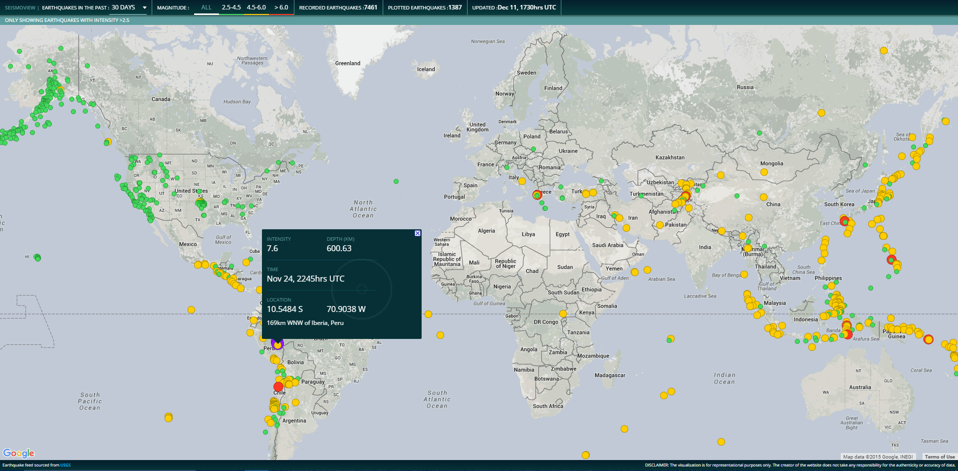
The user could select the time and magnitude ranges from the header to filter the marked earthquakes. The color of the marker corresponded with the magnitude range selector. Default time range was set to last half hour to represent the most recent earthquakes. The magnitude selector had colors matching the markers on the map and served as a legend.
Earthquakes above 2.5 showed better distribution therefore only earthquakes above 2.5 in magnitude were plotted. Animated markers were used to depict the earthquakes rather than static ones.
A special colored purple marker is used for the rare and generally devastating earthquakes above magnitude 7.5. This is not selectable form the magnitude selector.

Limitations
The default last hour view displayed very few earthquakes, even none at times due to non-plotting of quakes less than magnitude 2.5.
The animated markers adversely affected the performance of the application especially when earthquakes for a week or more were marked.
Final Version
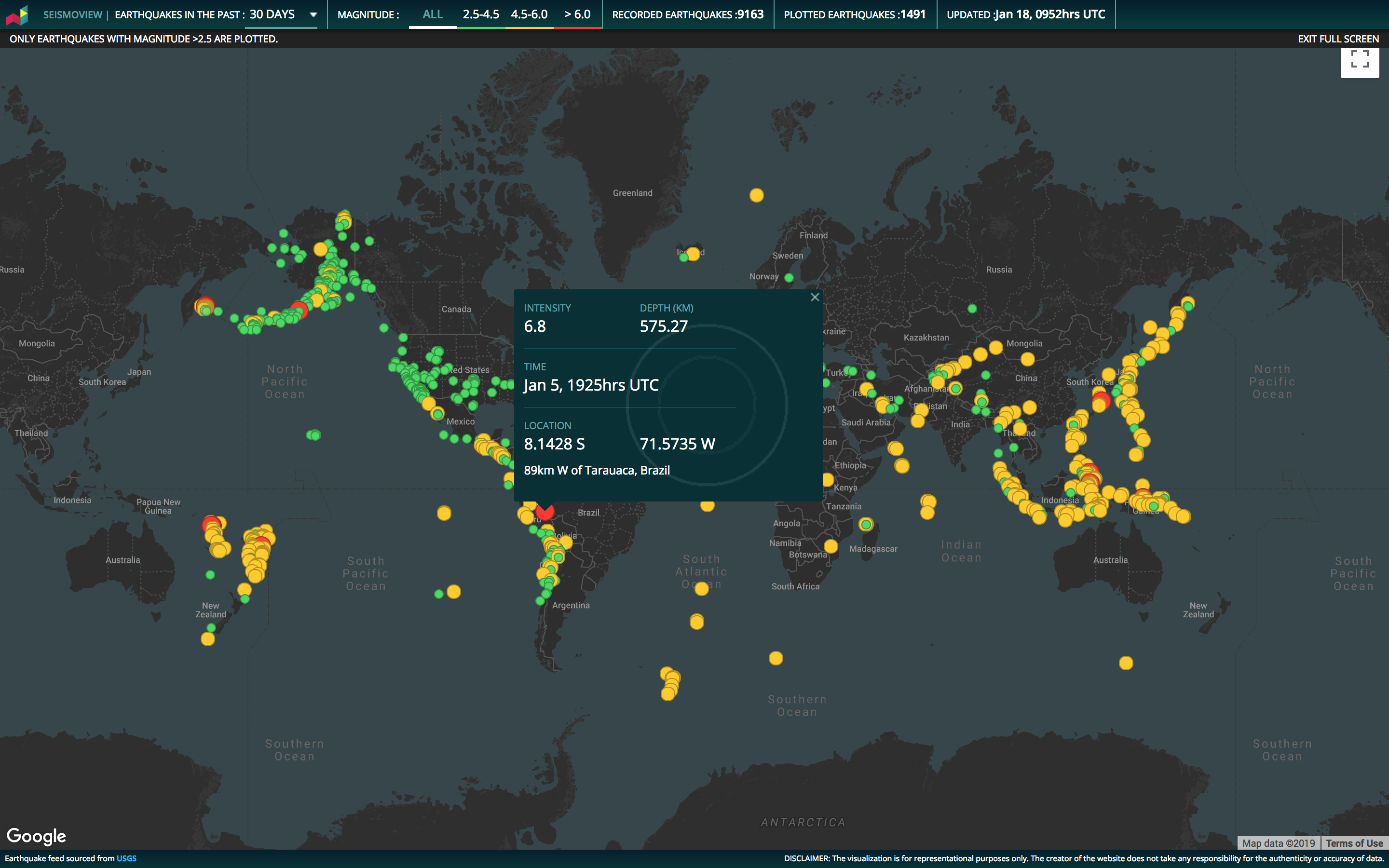
Color scheme of Google Maps was changed for a better contrast and alignment to the overall color scheme.
By default, earthquakes were shown for the last day. Animated markers were only shown when quakes up to 1 day are viewed.

Limitations
The radius of the animated markers could be mistaken for the area the earthquake affected. The markers can be too close to each other and selecting an individual one can be difficult.
Deductions From The Visualization
The visualization helps us understand the numbers and distribution of the quakes around the globe. Most quakes go unnoticed, but they are always happening.
The distribution helps us locate the regions of high seismic activity along the boundaries where the tectonic plates meet. The Pacific Ring Of Fire, for example, can be traced around the Pacific Ocean with the fault lines running along the west coasts of the Americas, around Australia, Indonesia and then all the way up to the Japanese coast